Page Layouts
Layout I
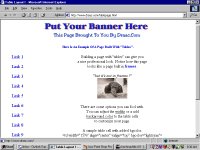
This layout gives the look of a frames page but really isn't. A nice clean look for your site. Add colors, images & content. Your personal web page will take on a whole new professional look.
Click Here For This Layout
Layout II
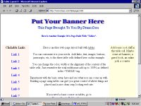
Similar to the first table layout, except this one has three columns. The added column can be used for a number of things, an online poll, advertising banners or a list of links. Edit these layouts to suit your needs.
Click Here For This Layout
Layout III
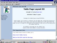
A table layout with sections for your content. Add more sections to this layout to suit your needs. This is the basic layout used on Draac's Gifs 123 home page. Customize this layout for your site.
Click Here For This Layout
Layout IV
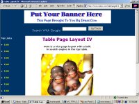
Similar to layout #3 but with an added search engine. Best used as is, with one content section and a sidebar for links. But can be altered to add more sections if you need them.
Click Here For This Layout
Layout V
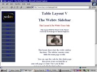
This layout is the MSNTV sidebar. The MSNTV sidebar layout is not compatable with any other browsers. Works with the Classic &Plus boxes. Scrolls like a frames page on a computer.
Click Here For This Layout
Layout VI
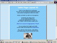
This layout lets you use two image backgrounds on the page. One background is set within a table to help the content stand out from the default background. Try different images in these backgrounds.
Click Here For This Layout
Layout VII
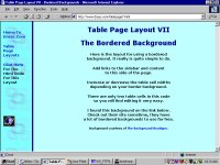
The border background layout is one of the standard ways of creating a web page on the internet. It is a nice effect for a web page, maybe a business or personal site. Give it a try, this may be the one.
Click Here For This Layout
Layout VIII
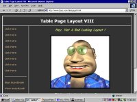
A layout built using multiple tables to form a great looking page design. A background image was used to cover the the whole page &tables (this might be hard to see on MSNTV). One of my favorite layouts so far.
Click Here For This Layout
Layout IX
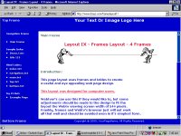
This layout was designed for computer users. This page layout uses frames and tables to create a useful and eye appealing web page design.
MSNTV users can use this if they would like to, but some adjustments should be made to the design to fit the layout the MSNTV viewing screen width of 544 pixels. Frankly, frames and MSNTV's browser just do not work all that well and should be avoided even in it's simplest form.
Click Here For This Layout
Layout X
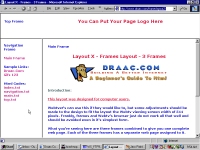
Another frames layout was designed for computer users.
This layout combines three Html files to build a page in frames with a top frame spanning the two lower frames.
Click Here For This Layout
Layout XI
Here is a layout that uses Html, CSS and IFRAMES to create a different look all together. This layout was designed for Internet Explorer 5+ set at 800 x 600. You will have to "tweak" it to look ok on other screen resolutions. This layout is not going to look or function all that well with MSNTV or Netscape 4x but will look alright if using Netscape 6.1+.
Click Here For This Layout
Layout XII
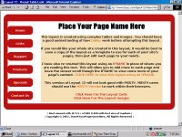
Here is a clean looking layout with rounded corners. It is created using complex tables with images. Perhaps a web site that could be used as a business site or even a personal web page. MSNTV users should use the version suited for their browsers, the computer version will be out of alignment on MSNTV due to the restriction of the width of the MSNTV browser.
Computer Users:
Click For Regular Layout
Click Here For Layout With IFRAME
MSNTV Users:
Click Here For This Layout
Layout XIII
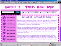
A layout for the young ladies who visit Draac.Com. It's very cool looking and great to use as a personal web site. Other can still uses this layout, just change the colors and the images and I'm sure you can find a look to suit your needs.
Click Here For This Layout
